Thursday, August 30, 2012

Flowers + Stars = Fun

Default title upload by motoblur

Don't you just love happy accidents? This card was one of them. I had lots of miscellaneous scraps and die cuts on my table and I put them all together and voila! Ha. I really love the sparkly star as the center of my flower. Don't know that I would have done that if it hadn't been sitting on my table. I think I'll do it on purpose another time.

Default title upload by motoblur

The "you" is cut from patterned paper. I like how it adds a bit of texture to it while still leaving it readable. The flower is a die cut from a MME sheet of die cuts (I didn't use my dies to make it.)

Do you have plans for the upcoming weekend? Friends have invited us to a block party in their neighborhood. We went last year and we ran into all kinds of people that we knew. Should be a fun time. They're excited about serving "chicken and dressing sandwiches" but Matt and I aren't really sure what those are. Apparently they're a big deal from their home town. Guess I'll have to try one for myself.

Make it a great one! :)

Supplies:
CS: White and Simply Chartreuse (Papertrey Ink)
PP: green/white polka dot (PTI bitty dot), yellow polka dot (MME?), pink for "you" (MME?)
Stamps: Wonderful Words additions (Papertrey Ink)
Ink: Fuschia (Fresh Ink)
Other: Turning a New Leaf die (PTI), star die, glitter, Wonderful Words die (PTI), Linen/Canvas impression plate (PTO)

Saturday, August 25, 2012

Papertrey Ink August Blog Hop


I love herringbone and tweed and burlap and felt and all that good textural stuff. So, when this month's Papertrey Ink blog hop was announced to use autumn patterns and textures I was all over it. I've had the herringbone Cuttlebug folder for ages and don't use it nearly enough. I just love it. And then then my son received a thank you card in the mail and it was so incredibly simple and graphic I just knew I wanted to try to recreate it.

My first step here was to cut the letters first out of the Rustic Cream layer. I measured the middle of the card, drew lines, and set my alphabet dies very carefully so that it would look right. After I cut the letters out, I ran the cardstock (with the negative die cut word) through my Big Shot using the impression folder. I was holding my breath the whole time and it came out perfect. Whew!


I then backed the negative letters with some Ripe Avocado cardstock. I matted this all on a Kraft cardbase. It looked a little plain and the orange (Terracotta Tile) was calling out to me so I punched a leaf, stamped it with a burlap pattern I have from an old red rubber stamp, and adhered it to the card front. Now, as I look at it, I'm thinking I went too far. I should have stopped with just the letters and the texture and skipped the orange leaf. Oh well. It's there now! Maybe I'll make another one...

I won't keep you. Thanks for stopping by. Enjoy the rest of your blog hop.

Supplies:
Stamps: country burlap pattern from an old, no-name red rubber stamp
Ink: Versamark for the pattern on the leaf
CS: Rustic Cream, Ripe Avocado, Kraft, Terracotta Tile (all PTI)
Other: alphabet dies (PTI), herringbone folder (Provo Craft), leaf punch

Monday, August 20, 2012

Make-It-Monday #77

I know this was from a couple weeks ago but I still wanted to post what I made. I had a lot of fun with this technique and felt quite artsy. The challenge was to use your ink pads as watercolors. Here's the link to the post with the video on Nichole Heady's blog.


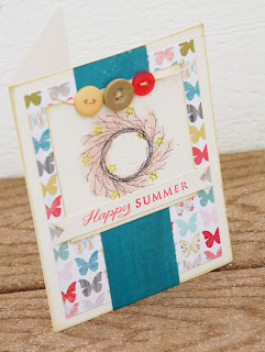
You can see a little better in the photo below where I stamped the wreath from Wreath For All Seasons (Papertrey Ink) and then used my Sweet Blush ink pad to color over it rather loosely. I then stamped a few berries and flowers over top the wreath in a dark pink and a green (the dark pink berries are rather hard to see, especially in the picture but they're there.)


The sentiment is stamped in Strawberry (Fresh Ink) on a double ended banner die (PTI). The PP is from MME.

Thanks for visiting. Make it a great week.

Sunday, August 19, 2012

Retro Sketches #25

I haven't been able to post lately because my desktop has been getting the blue screen of death and that's where my photos are stored and my PSE is loaded. I've been making do a little bit by directly uploading from my phone to Flickr but it's not the best. Today I'm using the laptop and the mediocre editing software that's on it because I wanted to play along with this week's Retro Sketches #25.


I've had a few friends lately have surgery or having some physical setbacks so I thought a "get well soon" card was in order.


I used some paper from MME and the stamp set is Everyday Classics from Papertrey Ink. It was an anniversary set from several years ago. A little bit of lace ribbon (American Crafts) and Ocean Tides ribbon (Papertrey Ink) finishes it off. It's all set on a Sweet Blush card base.

If you look closely you'll see a couple scored lines at the top of the white cardstock. It was just too much white space but I didn't want to stamp anything else in that space so I scalloped the edge and then added those two scored lines. It gave it some interest without taking away from the main image.

Thanks for stopping by.