Monday, June 29, 2015
Fusion challenge
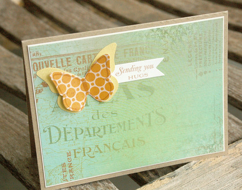
I'm playing along with the Fusion challenge.
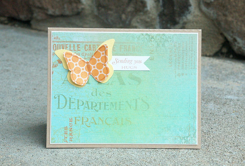
I started with the sketch and used this beautiful background paper I received from a friend. I added a two-layer butterfly in the upper corner (following the butterfly theme) and then a small banner. The colors said "serene" and "calm" to me and I almost made it a sympathy card, but I like the idea of a butterfly bringing hugs to a friend in need.
Great challenge!
Sunday, June 28, 2015
Freshly Made Sketches #192
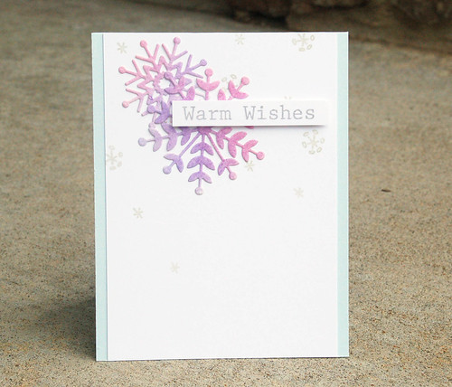
Hi and happy weekend! I'm entering this card in the Freshly Made Sketches challenge.
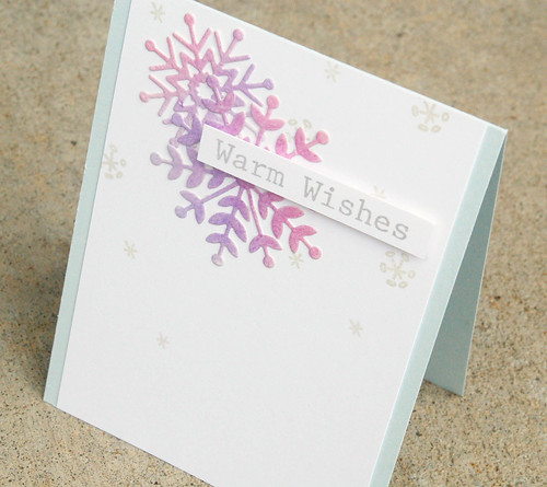
It's hard to think about winter and snowflakes when we're having lots of summer sunshine but it will be here soon enough and I'll be prepared with this cute and simple card. I'm loving digging through my leftover basket to use that stuff up. These snowflake dies were cut with SSS snowflake dies from a piece of paper that had been watercolored. Love the variety of purples in this and I'm not usually a purple fan. The cardstock base is Bazzill Icy Mint - my favorite light blue. The sentiment and stamped snowflakes are from Avery Elle.
Thanks for stopping by!
Thursday, June 25, 2015
Papertrey Ink June blog hop
I'm joining the Papertrey Ink blog hop today.
This photo was the inspiration for the blog hop.
And here are Nichole's words about the challenge:
The simplicity of these gray stripes paired with cream and orange flowers just speaks volumes in regards to card inspiration. Take these colors and transform them into a classic card that captures the beauty of the photo. Experiment with stamped flowers or die-cut florals. Add stripes using delicate Sheer Basics striped vellum overlays or cover plates. Let the photograph speak to you and see where it takes you!
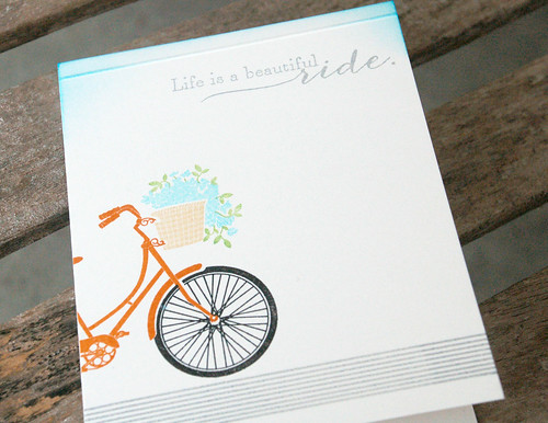
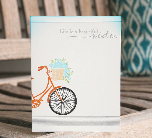
I loved the color scheme and I love stripes. I pulled out my Super Stripes intending to do a full panel of gray stripes on a cream panel. But, after the first one, it looked like a road to me and I got to thinking what could I fit on that road. A bike! An orange bike! I wish I had placed the bike further onto the card so more of the seat is visible but it is what it is.
After the bike was stamped I felt it was still missing something at the top. I added an embossed line on top of the sentiment and then rubbed some Distress ink on the top to simulate a sky.
This is a complete one layer card with just stamping and one little dry embossed line. I used Super Stripes, Pedal Pushers, Vintage Cream cardstock, and Canyon Clay ink.
Enjoy the hop!
Tuesday, June 23, 2015
CAS(E) this Sketch! #128
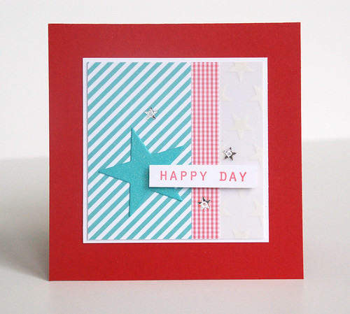
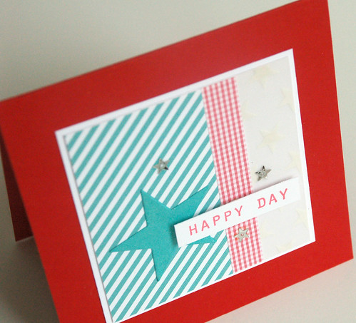
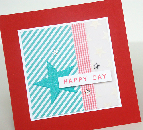
Hi! I have a card for this week's sketch with CAS(E) this Sketch.
This is a 4.25" square card. I used two strips of pattern paper and one strip of pattern vellum - hopefully you can see the stars on it.
This was a fun sketch - very versatile!
Sunday, June 21, 2015
Freshly Made Sketches #191 - take two
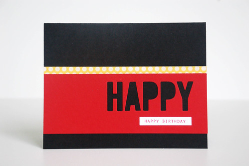
Here is another entry for this week's Freshly Made Sketches challenge. You can see my other entry here.
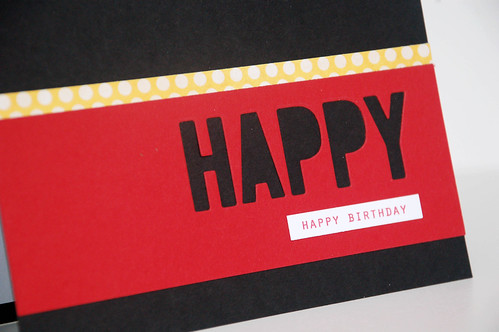
I thought this card was graphic enough to be a guy card. Strangely, the colors remind me of Disney for some reason. Maybe that's just me.
Thanks for stopping by.
Freshly Made Sketches #191 - take one
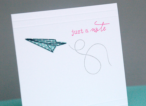
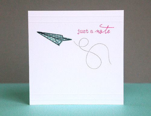
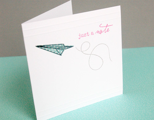
I'm joining the challenge at Freshly Made Sketches. The sketch below was our inspiration for this week. It was a good one and I made two cards that followed this theme - my other one is in this post.
I used the Happy Trails set from Papertrey Ink. I paper pieced the airplane and then added two scored lines (with my Scor-Pal) at the top and bottom. The card is 4.25" square.
Saturday, June 20, 2015
The Card Concept #37 challenge
Just popping in to share the card I made for The Card Concept challenge. This challenge was to use this beautiful photo as inspiration.
I loved the colors. I loved the butterflies. I loved the white piping on the cookies (I'm assuming they're cookies and I'm also assuming they're delish!)
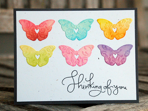
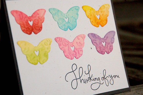
I embossed some paper then die cut it into butterflies. After that, I used two different colors of Distress inks for each butterfly! I'm thinking this card falls into the clean and layered style.
Enjoy your day!
Thursday, June 18, 2015
Celebrate
Tuesday, June 16, 2015
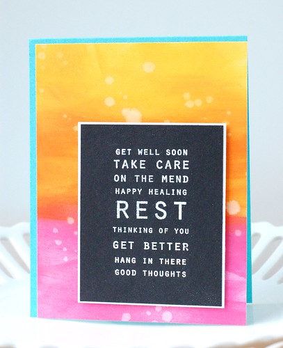
Get Well Soon
Monday, June 15, 2015
Fusion challenge - Blue Skies & Smooth Sailing
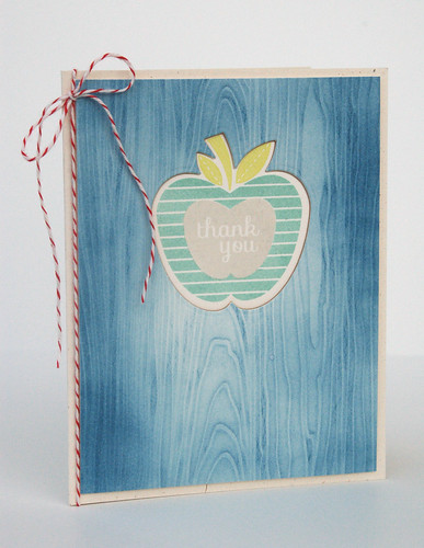
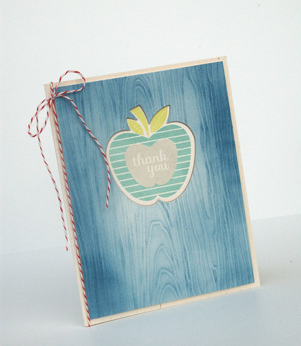
For some reason this Fusion challenge had me stumped for a bit. I was really hooked on the blue and the wood grain in the inspiration photo and just couldn't get off that train of thought. I also liked the negative cut out.
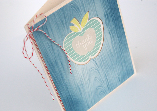
I impressed a piece of Rustic Cream (PTI) cardstock with the woodgrain impression plate (PTI). Then used my distress inks to color over the top of it.
I die cut an apple (Apple Prints, PTI) and then adhered it to my cardbase. I put foam tape on the back of the blue, woodgrain pattern and popped it up on top of the card base.
I also couldn't shake the nautical feel of the photo. I don't have one single anchor, boat, or other nautical stamp set but I thought if I added a bit of red then I'd have the blue and red, which to me is a classic nautical color scheme.
So, that's it in a nutshell. Thanks for taking a gander. I had fun with this one.
Jennifer
Sunday, June 14, 2015
Freshly Made Sketches #190
I'm playing along again with the Freshly Made Sketches challenge.
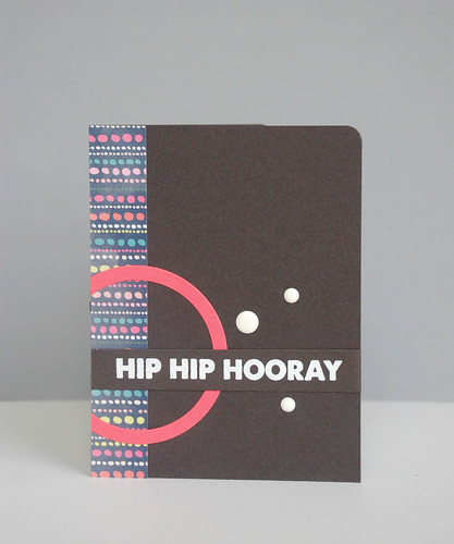
I went with something relatively contemporary and graphic.
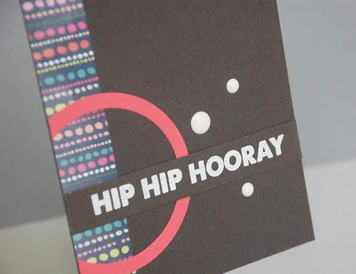
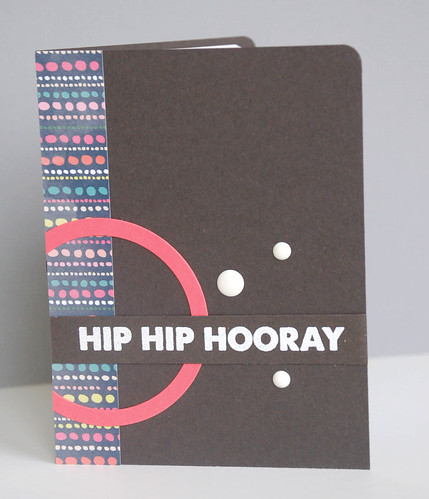
The card base color is Smokey Shadow from PTI - so not quite black but instead a very dark gray. The partial circle was simply two Nestabilities dies cut together from PTI Berry Sorbet cardstock. A bit of pattern paper down the side and a few white baubles and it's done. The sentiment is from MFT.
Thanks for looking!
Jennifer
Saturday, June 13, 2015
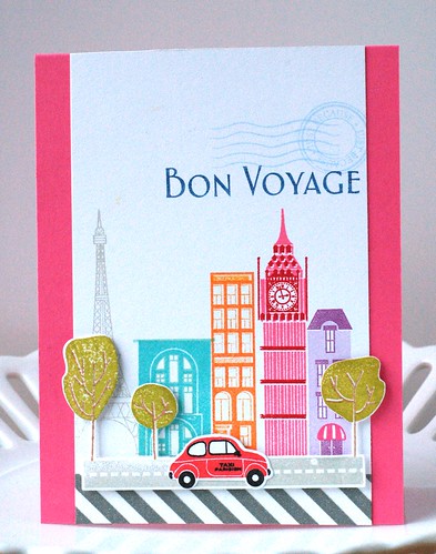
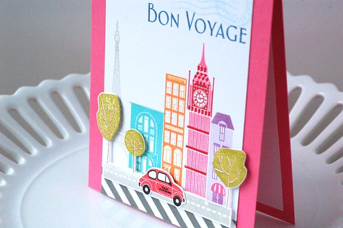
Bon Voyage
Thursday, June 11, 2015
Purple polka dots
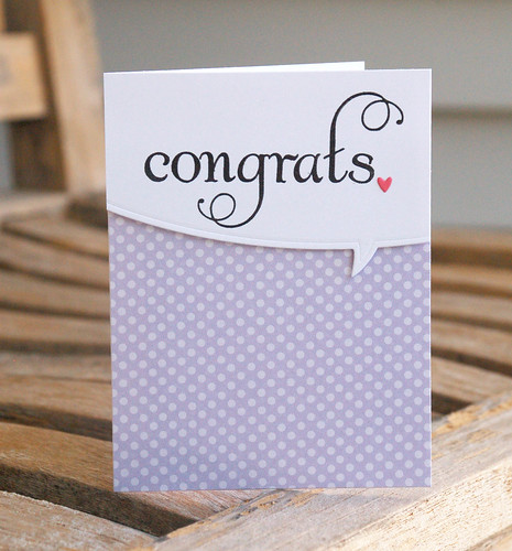
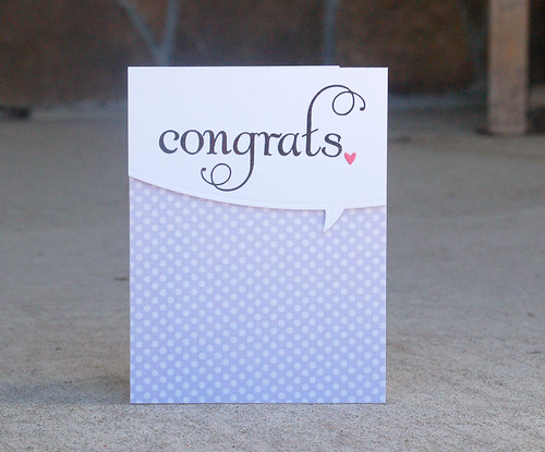
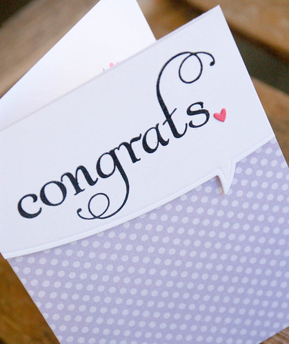
Just a quickie today. :) Received this polka dot patterned paper in a swap and thought it was so cute. It makes the best baby girl card!
I used my Mama Elephant bubble word die to cut a panel for my sentiment and then popped it up with foam tape.
I forgot to take a photo of the inside but I followed the theme and placed a tiny pink heart next to the sentiment.
Thanks for looking!
I used my Mama Elephant bubble word die to cut a panel for my sentiment and then popped it up with foam tape.
I forgot to take a photo of the inside but I followed the theme and placed a tiny pink heart next to the sentiment.
Thanks for looking!
Tuesday, June 9, 2015
CTS and PTI challenges!
I'm often inspired by the sketches at CAS(E) this Sketch, but I don't often have time to play or post my card. This time I did! Yea me! I'm also entering this in Papertrey Ink's Make It Monday challenge to use a neutral where we might otherwise use a color.
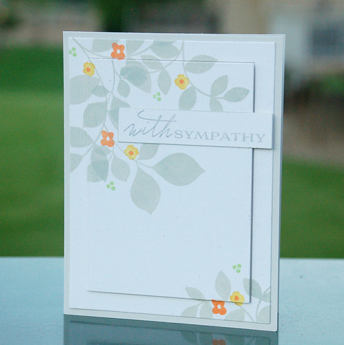
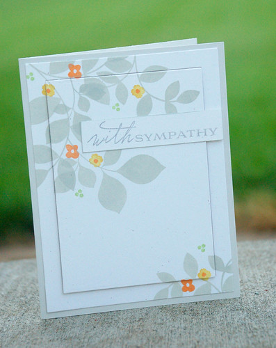
So many ideas with this one - just had to pick one! I stuck with the floral/botanical theme.
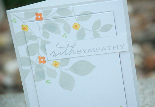
I used PTI's Turning a New Leaf in gray ink (inspired by the PTI Make It Monday challenge) on the upper left and bottom right corners. I added a few bits of color - I really wanted to keep it subtle but not drab. I also knew this was going to be a sympathy card, so it really needed to be more subdued, IMO.
I used a MFT frame and popped up the center panel on foam tape for some dimension.
The sentiment label was edged with gray ink to just ever so subtly bring it out from the background.
Thanks for looking!
Sunday, June 7, 2015
The Card Concept #36
I think this may be my first time playing along with The Card Concept challenge. I know it won't be my last. I had fun playing around with ideas for this one - this was actually my third card. The first two were just "meh". You know that feeling? I think I was trying out some different styles and they just didn't fit. So...going to my tried and true Clean and Simple with a touch of Graphic.
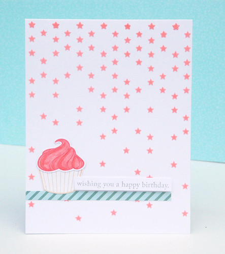
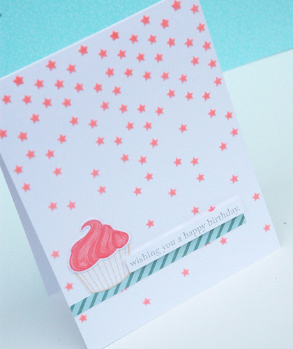
The cupcake is an obvious inspiration but I also pulled in the stripes (and their color) from the straws into my little strip of striped paper below the cupcake.
The background was made with some a stencil and embossing paste that I colored with a reinker. The sentiment was popped up with some foam tape.
Freshly Made Sketches #189
I played along with Freshly Made Sketches again this weekend.
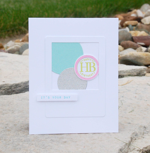
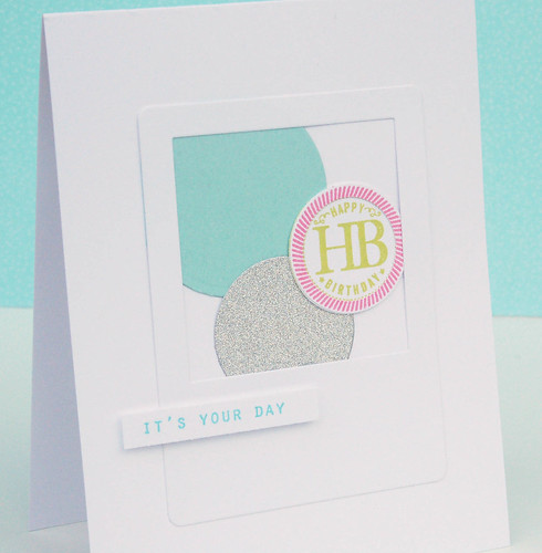
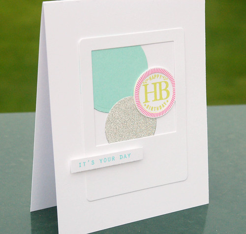
This sketch stumped me for a bit. So while I was waiting for divine inspiration to hit I was poking through my bin of "extras and leftovers" and that's where I found every single one of the pieces for my card. My bin now has five fewer pieces. :)
The silver piece is glittery and hard to capture the sparkle. I thought this could work for my teen daughter's friends.
The supplies are mostly (all?) from Papertrey Ink.
Subscribe to:
Posts (Atom)