Wednesday, April 25, 2012

Papertrey April Blog Hop Challenge


Here's the challenge for this month's blog hop.


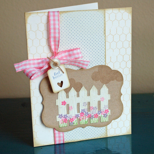
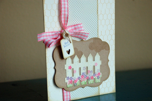
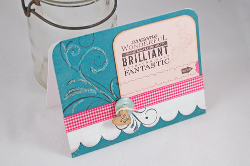
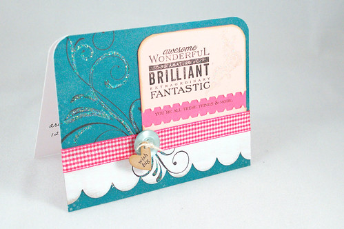
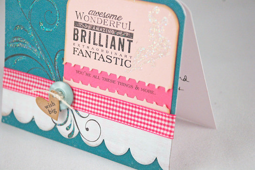
Boy, I haven't participated in a Papertrey Blog Hop in a long time. I usually can't get my act together to make something on time and post it. But, today I did. And I'm really tickled about how this card turned out (minus the little ink smudge, but we won't talk about that okay?). It's delicate and lacy and has layers and patterns but it's still flat enough to mail. The practical side in me loves that.

2012 04 15_5934_edited-1


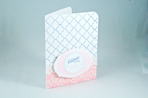
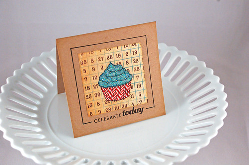
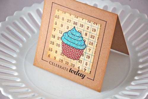
I really love this particular quatrefoil-looking stamp from the Background Basics: Retro set and don't use it nearly enough. The pink inks I had weren't going to be dark enough so I decided to emboss the Mat Stack. It appears my photo got a little blown out but I assure you it's very pretty IRL and the "just for you" below "Celebrate Today" really is dark enough to read. Sometimes (okay, all the time) I really wish I knew more how to edit my photos so my cards would look more true to life. Ah well, I'll just keep practicing.

2012 04 15_5930_edited-1

Have fun hopping through all the other PTI blogs!

Supplies:
Paper: White cardstock, Pretty Pastels patterned paper (both PTI)
Ink: Gypsy Blue (Fresh Ink)
Stamps: Everyday Treats, Background Basics: Retro, Friendship Jar (all PTI)
Other: lace (American Crafts), embossing powder in Rose (Zing), Mat Stack 1 die (PTI), Corner Chomper

Saturday, April 21, 2012

Sorta shabby chic

Melissa Phillips issued a challenge on the PTI forum to try a style that is out of your norm. For me, that would be shabby chic - layers, buttons, bows, lace, patterns, embellishments, distressing etc. I naturally gravitate to a CAS style with lots of white space. For this card, I kept telling myself layers, layers, layers, more, more, more. It doesn't have quite the level of awe-inspiring gorgeousness that Melissa's cards have but I like it nonetheless. It was challenging but rewarding to step out of my comfort zone and exercise my creative chops. I don't have anyone in mind for this card right now but I hope when the time comes it will cheer someone up that is feeling a bit under the weather.

2012 04 21_5963_edited-1

You'll notice that the flowers are dark pink and light pink, and dark purple and light purple. I used only two colors of ink - Hibiscus Burst and Winter Wisteria but I stamped each flower twice to give a little depth to them.
2012 04 21_5966_edited-1

Supplies:
Stamps: Love Lives Here, Tiny Tags, Up, Up and Away (all PTI), Chicken Wire (WMS)
Ink: Hibiscus Burst, Winter Wisteria, Vintage Tea Dye duo (PTI), Basil and Gypsy Blue (Fresh Ink)
Paper: Vintage Cream and Kraft (PTI), blue dotted paper (Making Memories)
Other: Mat Stack 4 die, fence, and Tiny Tags die (PTI), woodgrain impression plate (PTI), pink gingham ribbon (CTMH?), button

Wednesday, April 18, 2012

It's a Banner Birthday

I was sitting at the salon the other day and my stylist had an advertisement taped to the mirror and it gave me the idea for these cards. The two cards are essentially the same except for the different banner colors and the different card base colors - one is Vintage Cream and one is White.

2012 04 15_5927_edited-1

This first card uses Simply Chartreuse, Summer Sunrise, Hibiscus Burst and Pure Poppy for the banners on a white background. Ink is Slate by Fresh Ink.
2012 04 15_5929_edited-1

2012 04 15_5926_edited-1
The other card uses Raspberry Fizz, Hawaiian Shores, Simply Chartreuse and Orange Zest banners on a Vintage Cream card base. The sentiment is stamped in Slate by Fresh Ink. It's a really lovely shade of mid-tone gray. I stamped it a little low on the card and it looks a little funny but not funny enough to throw it out. Someone will get it and not by the wiser. ;)

I (still) don't have banner dies but I picked up this tip to make your own banners somewhere in blogland and thought that it was genius. You simply use a corner of a piece of paper, trace it at the end of your strip, and then cut it out.

I took some pictures so you can see what I mean.

Here's my strip of paper - 5/8" wide.
2012 04 15_5910_edited-1

Take the square corner of a piece of paper and line it up so that the tip is in the middle of your strip, like this.
2012 04 15_5912_edited-1

Then take a pencil and trace around the white piece of paper onto your strip. You'll have a bitty triangle.
2012 04 15_5916_edited-1

Cut the tiny triangle out.
2012 04 15_5920_edited-1

Trim your banner to whatever length you want. Here, I used 1" long banners.
2012 04 15_5921_edited-1

To make it easy on myself, I simply traced this banner edge onto the rest of my paper strips.
2012 04 15_5923_edited-1

Voila! Banners! :)

I really loved the simplicity of these cards and how I can change up the banner colors to whatever I want. Maybe this design would be good for graduation cards in school colors...? Or baby colors for a new arrival...?

Thanks for visiting and I hope you have a great day!

Supplies:
Stamps: Movers and Shakers (PTI)
Ink: Slate (Fresh Ink)
Paper: Vintage Cream, White, Raspberry Fizz, Hawaiian Shores, Simply Chartreuse, Orange Zest, Summer Sunrise, Hibiscus Burst, Pure Poppy (PTI), Black and White polka dot paper is PTI
Other: embossing folder (Provocraft)

Sunday, April 15, 2012

Cupcake


2012 02 28_5345_edited-1

A little square card for you today. I stamped Cupcake Collection on some MME patterned paper and then cut it out. I don't have the dies for this stamp set but it's easy enough to cut so the dies keep getting pushed to the bottom of my wish list.

I backed it with the numbered paper by MME and then stamped the sentiment below the paper. I did do some quick measuring to be sure I had it fairly centered. Then, I took my pen and drew the line around it by hand.

2012 02 28_5348_edited-1

I dabbed on a bit of glue on the top part of the cupcake and then sprinkled some glitter on top. Inked the edges and then I was all done. This card went so quickly I made another one just like it. :)

Supplies:
Stamps: Cupcake Collection (PTI)
Ink: black (Memories)
Paper: pattern paper (MME), Kraft (PTI)
Other: American Crafts black marker, glitter

Tuesday, April 10, 2012

12th Birthday

My little girl was born 12 years ago. Only one more year and I'm going to have a teenager - yikes!


She didn't get a birthday cake, per se because her birthday was Easter Sunday. We just put candles in the dessert and called it good. :)

For her card I tried so hard to channel my inner Melissa Phillips and make something pink, girly, and glittery. I'm not sure I succeeded but DD seemed to think it was okay. I almost gave up and tossed it in the trash but just kept going with it, adding things here and there until I was okay with it - not thrilled, mind you, but "okay."

2012 04 08_5893_edited-1

I knew I wanted to use the new PTI zipper die that I got. That's just too fun to not use.

2012 04 08_5894_edited-1

I also wanted to try cutting a scallop edge out of chipboard, paint it, and stamp a pattern on it (a la Miss Melissa). You can barely see the faint gingham print on the white chipboard scallop. I liked this technique and I think I would distress it even more than I did this time so that there is a lot less white. I'd also use a brighter pink so that the gingham print would be more visible.

And then there was the glitter. What 12 year old girl doesn't like glitter? I wanted to incorporate that, too. And this is where things were going to heck in a handbasket. I just couldn't get all these elements to work together very well. I went through my inspiration binder to find a layout that could work with the elements I had and CASE'd that.

Here's the card after she ripped open the zipper. She didn't see it at first and I forgot about the zipper part (duh!) and after about 10 minutes, she came to me and asked if she could really open it where it said "Pull Here". Oh. Um, yeah. Please do! She thought it was fun. As did her brother.

2012 04 10_5854_edited-1

2012 04 10_5855_edited-1

I think if I were to do this again I would use the same color ink - a medium gray - behind all the flourishes. The flourish on the pink cardstock is a very light gray and is covered with glitter. And the large flourish on the blue paper is stamped in a bold black ink. Lesson learned.

On the inside of the card I used another stamp from Movers and Shakers: Sentiments.

2012 04 10_5856_edited-1

So, there you have it. The card that almost wasn't. :)

Supplies:
Cardstock: Sweet Blush, white, Hibiscus Burst (PTI)
Stamps: Movers and Shakers: Sentiments, Fancy Flourishes, Tiny Tags (all PTI), Gingham & Co. (WMS), flourish on the pink cardstock is from the Clever Girls set (Amuse Studios)
Teal patterned paper: MME
Ink: Black (Memories), Pebble (Amuse) - under the flourish on the pink cardstock so can't really see it, Provincial Gray (Fresh Ink), Bubblegum (Amuse) 
Other: corner rounder (We R Memory Keepers), Tiny Tags die (PTI), twine (PTI), button (PTI), gingham ribbon from stash, medium scallop edge die (PTI)

Saturday, April 7, 2012

Inks

Sometimes it's hard to know whether an ink color you want may match an ink color you may already have. Several people out in blogland have been kind enough over the years to post swatch cards of various brands. I have a mix of brands - Papertrey Ink, Amuse, Fresh Ink, Memento, and Colorbox mostly - and stamped these swatch cards to keep at my stamping table so I can reference them as needed.

My reds and pinks:
Ink_reds_pinks

My oranges and yellows:
Ink_oranges_yellows

My greens:
Ink_greens

My blues:
Ink_blues

My purples:
Ink_purples

My browns and grays:
Ink_browns_grays

I noticed that some of the colors show up not true to life. Like Pure Poppy and Strawberry look nearly the same on this blog post but they are really quite different IRL. Pure Poppy is a much deeper (bluer) red than Strawberry which has more watermelon/coral in it. And Memento is not nearly that obnoxious looking. Nonetheless maybe it will help give you an idea of it and help someone out there. :)

Easter blessings to you all...