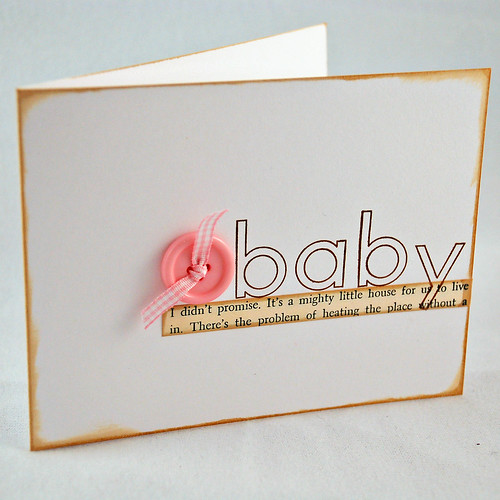
I made several quick baby cards all following this same pattern - just different colors. After I put the text paper down on this first card (the "pink" one) I realized that I adhered it too high and it looked a little off balance. It should have been placed a bit lower but pulling it off would have made a mess and it wasn't that bad so I just left it.

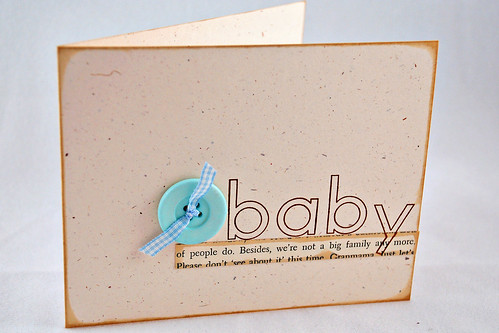
Nonetheless, when I made my next card, I adhered that book text strip a little lower on the card to hit the "rule of thirds" line.
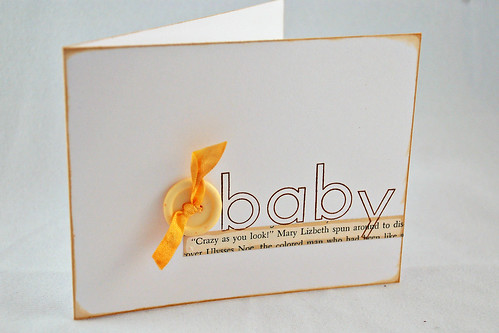
Here's the yellow one for when you just don't know yet what the little bambino is going to be - boy or girl.

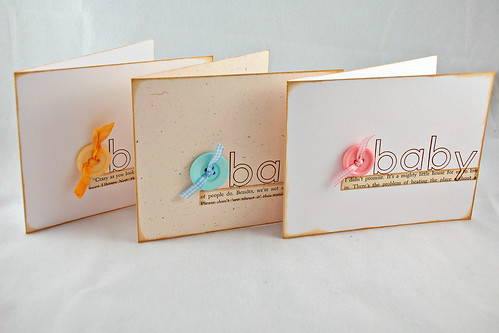
And all three together. So quick and simple and now I have three baby cards just waiting to be used.

Supplies:
Stamps: Outline Alphabet (PTI)
Paper: White and Rustic Cream (PTI)
Other: buttons (PTI), ribbons, text paper from an old book
Have a terrific week!
6 comments:
I love these. Simple, but so perfect. You are making me want the outline alphabet set. I do agree that the balance on the cards with the focal point just a bit lower is better. But, I still like them all!
Love the card set! Great to see an example of outlines alphabet without coloring too! And I agree, I like your lower placement the best.
Absolutely beautiful! Love this set a lot...they are perfect in every way. :)
Arlene.
Great set! I love the simplicity of them.
TFS
Ang
I love the sweet, CAS cards. I agree, too, like the paper strip a little lower on the card.
Simple and perfect! Love this idea!
Post a Comment