This month's challenge was to try a nontraditional color scheme for a card or tag. Nichole put together six different color schemes and I picked this one:
The pinks and turquoises are so happy together! :)
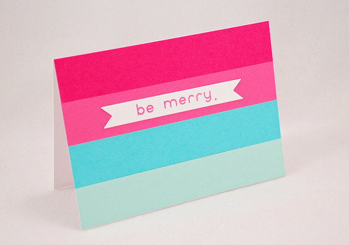
I created a couple cards using this scheme. Here's the first one.

I adhered strips of cardstock to my card base - Raspberry Fizz, Hibiscus Burst, Hawaiian Shores, and Aqua Mist. Then, I die cut a banner out of white cardstock and stamped "be merry." on it. I got the stamp a long time ago and not sure who the manufacturer is but I thought the modern sans serif font was a good match for the minimalist look of the card.
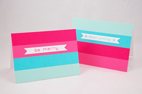
Here's another card I did following this same scheme and layout - just moved around the cardstock strips and changed the sentiment.

And here they are together.

Do you prefer one over the other? I think I like the first one best. Maybe because of the font of the sentiment, or maybe it's because of the order of the cardstock strips. Can't quite pin it down.
Also, I should note that the layout of this card was completely inspired by a piece of stationery I saw on Pinterest. Isn't it a great layout?!
Enjoy the rest of your hopping.
.jsk
Supplies:
Cardstock: White, Raspberry Fizz, Hibiscus Burst, Hawaiian Shores, Aqua Mist (all Papertrey Ink)
Ink: Hibiscus Burst, Hawaiian Shores (PTI)
Stamps: unknown mfr for the sentiment stamps, I think the star is from All Star (PTI)
Other: banner die (PTI)


19 comments:
Beautiful! Love your bold take on the colors! I like them both :)
Beautiful, Jennifer! Love the bold strips of color and CAS design.
these graphic cards really pack a punch! they look great! :)
A great card to mas produce. Fun!
So CAS and so so pretty Jennifer!
SO CAS, SO AWESOME!
So bright, fun and clean. I love it!
I absolutely love your bright and bold stripes! This is so fun!
You make perfection look easy. Your photos are just beautiful.
This is way awesome!
love this! So simple, but stunning!
Love them both. What a great layout. I think I prefer the one with the sentiment in pink. At least on the computer, it pops more.
I love colour blocking -these cards look fabulous.
these are awesome! love the stripes of color!
I'm a sucker for great CAS graphic style, so I LOVE these. There is something about the "be merry" card that pops a little mor.
The bold colourful stripes create a fabulous clean and simple design. Great set of cards.
ok -- can I just tell you...BRILLIANT! ha ha! I love these! I think the Be Merry card stands out to me more, but only because of the color of the sentiment, but these are awesome! Clean, graphic, awesomeness. Thanks for sharing!
Oh, these are GORGEOUS! I love the design, and it's perfectly executed from your inspiration!
great cards. tfs.
Post a Comment