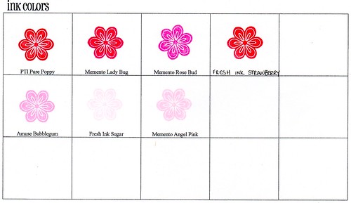
My reds and pinks:
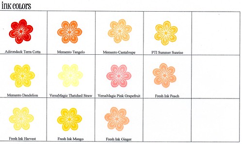
My oranges and yellows:
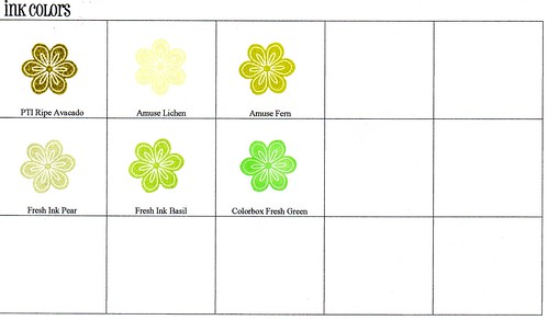
My greens:
My blues:

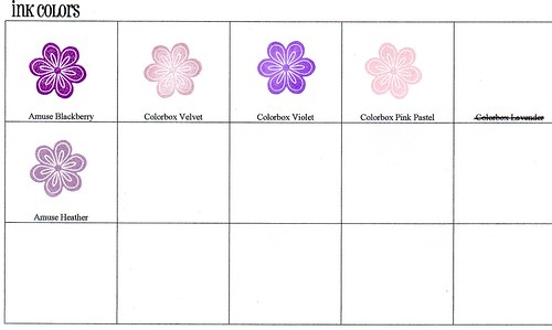
My purples:
My browns and grays:
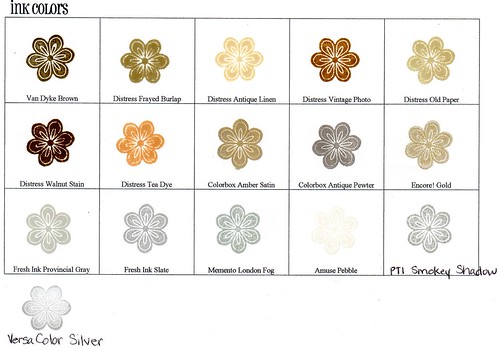
I noticed that some of the colors show up not true to life. Like Pure Poppy and Strawberry look nearly the same on this blog post but they are really quite different IRL. Pure Poppy is a much deeper (bluer) red than Strawberry which has more watermelon/coral in it. And Memento is not nearly that obnoxious looking. Nonetheless maybe it will help give you an idea of it and help someone out there. :)
Easter blessings to you all...
4 comments:
Thanks so much for taking the time to post this, Jennifer! The Fresh color chart they have on site can really drive me nuts :)
Thank you so much for sharing this!! Sharing our swatches will give us a better idea of the colours whens stamped.
This is a really useful resource Jennifer, thanks so much for posting!!
Thanks for the lovely comment you left on my blog too!!
This is a really useful resource Jennifer, thanks so much for posting!!
Thanks for the lovely comment you left on my blog too!!
Post a Comment